Last updated: February 28, 2024
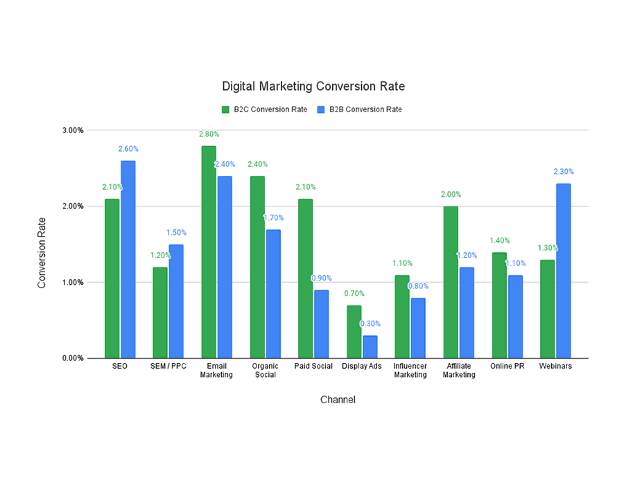
According to our internal data, the average SEO conversion rate is 2.4%. This means that, if 100 people come to a particular page on your website from SEO, 2 or 3 of them will perform a conversion action such as a form fill, white paper download, or e-mail list signup.
While it’s useful to know the average conversion rate for an SEO-optimized page, it’s more useful to understand what conversion benchmarks to strive for on a particular type of SEO page. (It is also valuable to compare SEO conversion rate by industry, which we have done here.) For example, you’d expect a different SEO conversion rate on a product page than a thought leadership article, since the conversion is lower stakes on the article.
Below are the SEO conversion rates we’ve seen over 15 years of working with 100+ middle market and enterprise clients, organized by page type. Afterward, I explain how to maximize conversion on each page type.
| Page Type | Conversion Rate | Example |
| Product Landing Page | 2.9% | Dropbox for Business |
| Service Landing Page | 2.7% | SEO Services |
| Application Landing Page | 3.1% | Asana for Project Management |
| Location Landing Page | 1.1% | SEO Company in San Francisco, California |
| Industry Landing Page | 1.8% | Biotech SEO Services Company |
| Case Study | 3.5% | Cadence Design Systems: A Case Study |
| Problem & Solution / FAQ Page | 2.7% | What Reading Level Should You Write at for SEO? |
| Thought Leadership Article or Blog Post | 2.0% | What to Expect From an SEO Agency |
| Hub Page | .5% | B2B Content Marketing |
| White Paper | 4.6% | SEO Benchmarks by Industry |
Increasing SEO Conversion Rate on Various Page Types
For each type of SEO page in the chart, there are different best practices for increasing your conversion rate. We have summarized them in this section.
Product Landing Page
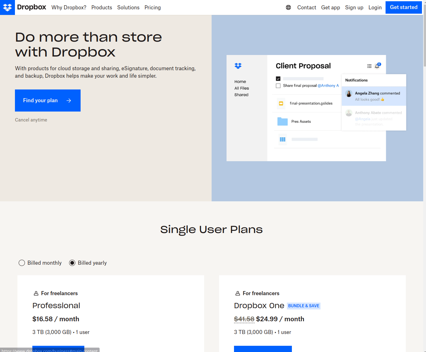
A product landing page is the purest SEO landing page. The conversion action is clear: get the user to buy or download the product. Therefore, there are a few things you need to do in short order to sustain their attention and convince them that now is the time to act:
- Describe the problem the product solves in large font at the top of the page; adjacent to that description should be an image that illustrates the problem being solved (which could take the form of a picture of your product in action)
- In just a few words with plenty of white space around it, explain how the product solves the user’s main problem, and how easy it is to buy the product
- Call-to-action button in clickable color, with a reassurance nearby such as “free trial”, “cancel anytime”, or “money back guarantee”
- Potentially some validation elements such as logos of awards the product has won, blue chip companies that use it, or press it’s been featured in
- All options for buying the product in a simple, concise layout
Service Landing Page
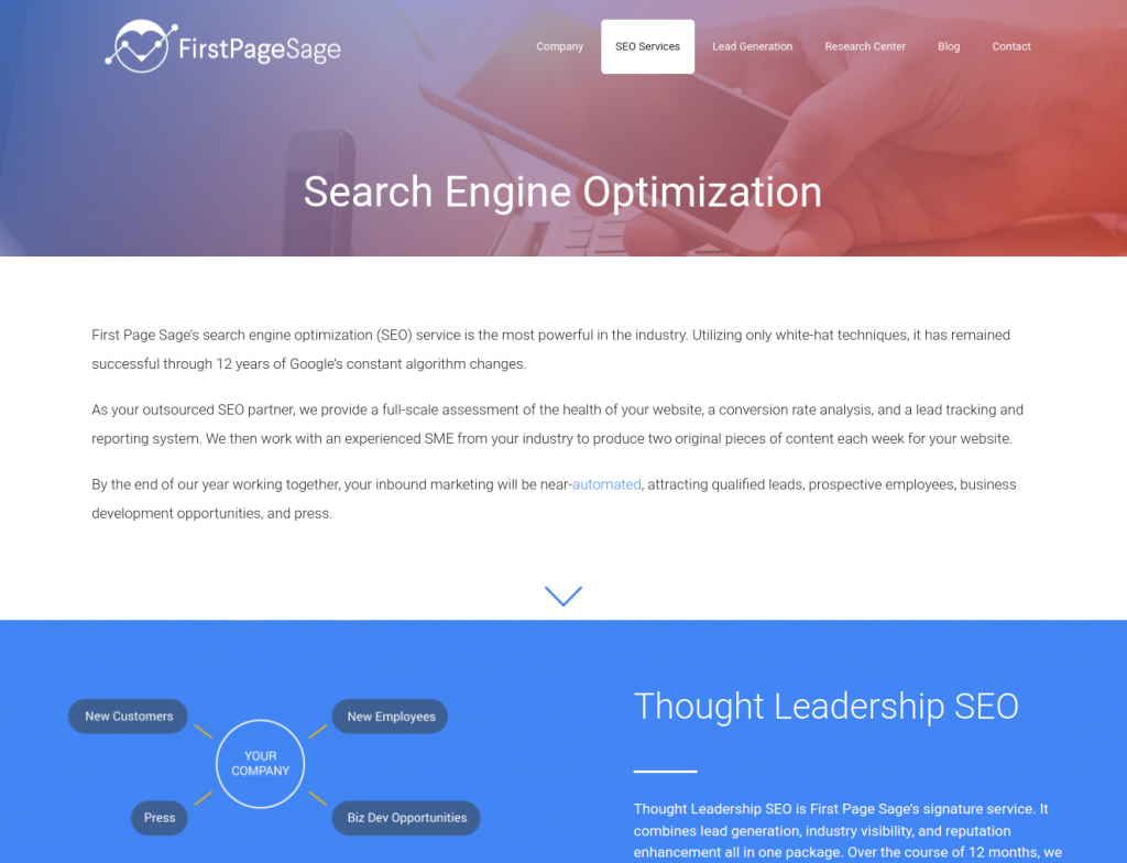
Service landing pages require many of the same elements as a product landing page, but there are a few key differences when it comes to conversion. The same core elements will all be present in a conversion-optimized service landing page, with these key differences:
- The call-to-action for a service page should always be a contact form, as these provide the simplest way for customers to reach out to your sales team. Using a contact form also allows you to collect additional data about each lead that will help your marketing team refine your overall strategy.
- Devote more of your page to validation elements as they are particularly important when it comes to services. Include past clients, testimonials, and examples of unique problems that your clients have faced and the ways you’ve had to personalize the service you offer in order to address those challenges.
- Unless you’re offering a simple one-size-fits-all service, you won’t be able to list every permutation of your service. Instead, focus on the elements of your process that make your services stand out in your field.
Application Landing Page
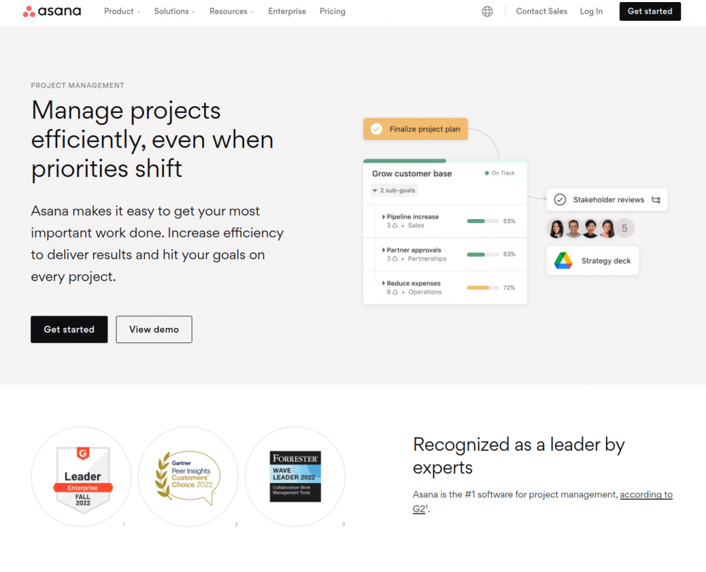
An application landing page is meant to convey to the prospective customer that you have experience with their particular problem or pain point. Therefore, it should begin by briefly restating the issue and how difficult, complex, or painstaking it can be.
Afterwards, it should describe the usual solutions and why they are less than ideal. (Relating in an honest, even-keeled way is key here.)
Finally, it should describe in a thoughtful but utilitarian—almost workmanlike—way how your company has solved the problem such that they can understand how it would help them. If there is a direct CTA to buy on this page, it should do so in an earnest way. If the CTA is indirect, such as reading a case study from a company who dealt with the same issue, you should simply refer to it at the end and have a good-sized graphic linking to it.
Location Landing Page
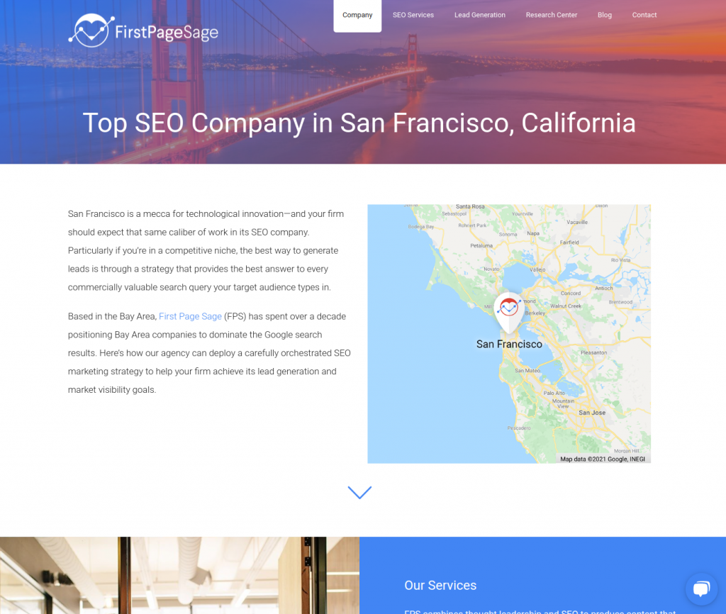
A location page attracts searchers who are seeking a local product or service, and as such, requires you to convince them that your company serves, and succeeds with, customers in their geographic area. Including 1-2 sentences about serving the locale targeted in the keyword is a good conversion practice, as is local case studies or testimonials and descriptions of the problem your business is solving that feels unique to the area. With 2-4 localized elements to the page, the rest of it should simply be dedicated to making the case that your product or service is trustworthy, a good fit for their needs, and priced correctly for them.
Industry Landing Page
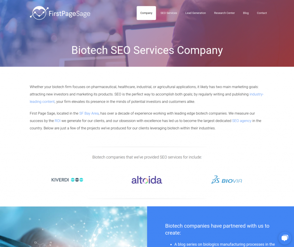
An industry landing page is similar to a case study, but rather than demonstrating that your company can solve the problems of one customer, it demonstrates that you understand the complexities of an industry in relation to what you sell. It should begin by reminding the searcher of the pain points they are experiencing. You have a good chance of converting the user if you can effectively make them nod: “Yes, that’s exactly the difficulties I deal with every day.”
Directly afterwards, the page should address how your company will make their life easier. The conversion will be easier the more you can surprise them with the fact that such a great solution exists, particularly if you explain how your company does it just enough for it to feel believable. When people deal with the same issues day in and day out, it’s hard to imagine there’s something much better they could use, so it’s helpful if you walk them through it.
An attractive button with a CTA like “Learn More” or “Free Trial” should appear halfway down the page, as well as perhaps a case study and links to thought leadership content. A gated white paper can also work well for products with longer sales cycles.
Case Study
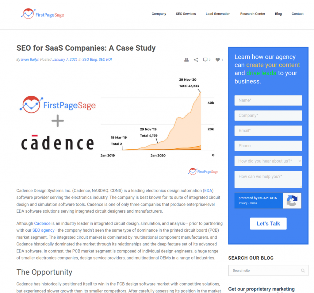
The key to conversion on a case study page begins with doing what’s expected: clearly stating the customer’s problem and how your product or service solved it. By demonstrating understanding and excellence in your approach, your company’s appeal rises. Because it’s like a story, the case study must continue uninterrupted, with a CTA on the page’s sidebar and underneath the case study.
Case studies are unique in the conversion world because, depending on the flow of your website, they can either be intermediary steps in the funnel with relatively low conversion, or a final step with very high conversion. When they’re a final step, links to them appear in thought leadership articles, on product or service landing pages, and even on the About page, pushing the information-rich user over the line with a final demonstration of how your product worked for a company similar to theirs.
Problem & Solution / FAQ Page
With proper keyword research, Problem/Solution and FAQ pages bring a lot of SEO traffic. Few page types respond more clearly to the user’s search intent, which is either “I have a question about X” or “I have a problem I need to solve.” For the same reason, they can convert quickly and thus require 2-3 CTAs per page. When a searcher is about one third of the way through the page, they may have read enough to want a quick solution; thus, a CTA should be present. A sidebar CTA should also appear about halfway down the page. Finally, an end-of-page CTA is exactly what’s needed for the engaged reader who read the entire solution.
One thing to avoid, however, is giving so much information that the user feels they don’t need your company’s help any longer.
Thought Leadership Article or Blog Post
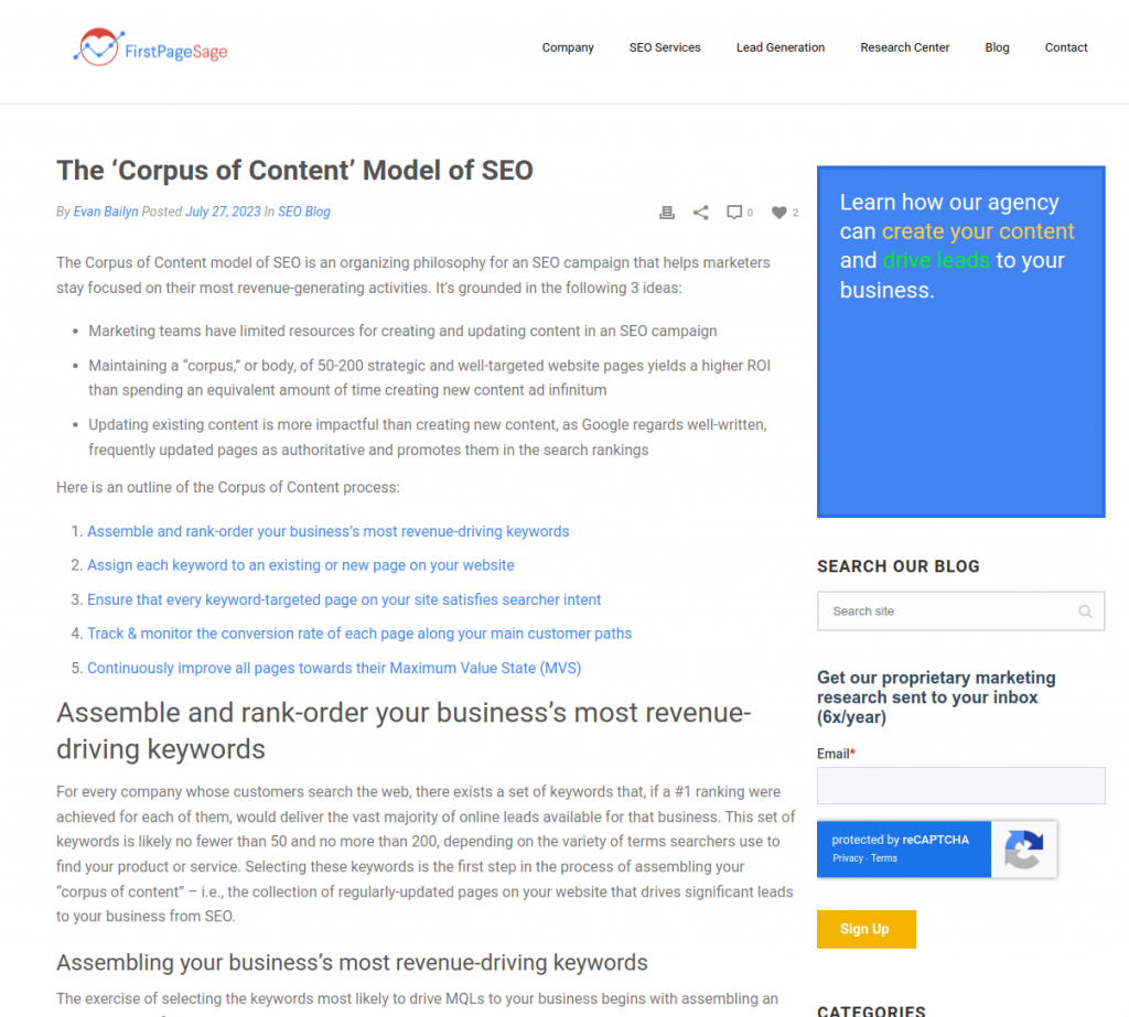
Conversion on an article is a matter of deeply reading the user’s search intent. Because there are so many complexities to interpreting a keyword string typed into a search box, suffice it to say that a person with high emotional intelligence must determine what that searcher wants to see on the page they end up clicking on. The suitability of that response will determine conversion far more than the placement of UI elements on the page. And often, a simple photo of the author with a one-line bio and an e-mail address below is enough to convert an inspired reader. Additionally, a link to other relevant articles as well as the appropriate Product/Service page will push the reader towards conversion. It’s also a good idea to include a mini contact form in the sidebar.
Hub Page
A hub page’s job is to direct searchers to other articles on the site, so it’s naturally very low conversion. However, when it does convert, it’s because it appears authoritative, not only linking to relevant landing pages and thought leadership articles, but including logos of blue chip clients, awards, and press, and leaving the user with the impression that the company that created this content is the industry leader. Your best bets for conversion are buttons linking to product/service landing pages as well as a simple contact form in the sidebar.
White Paper
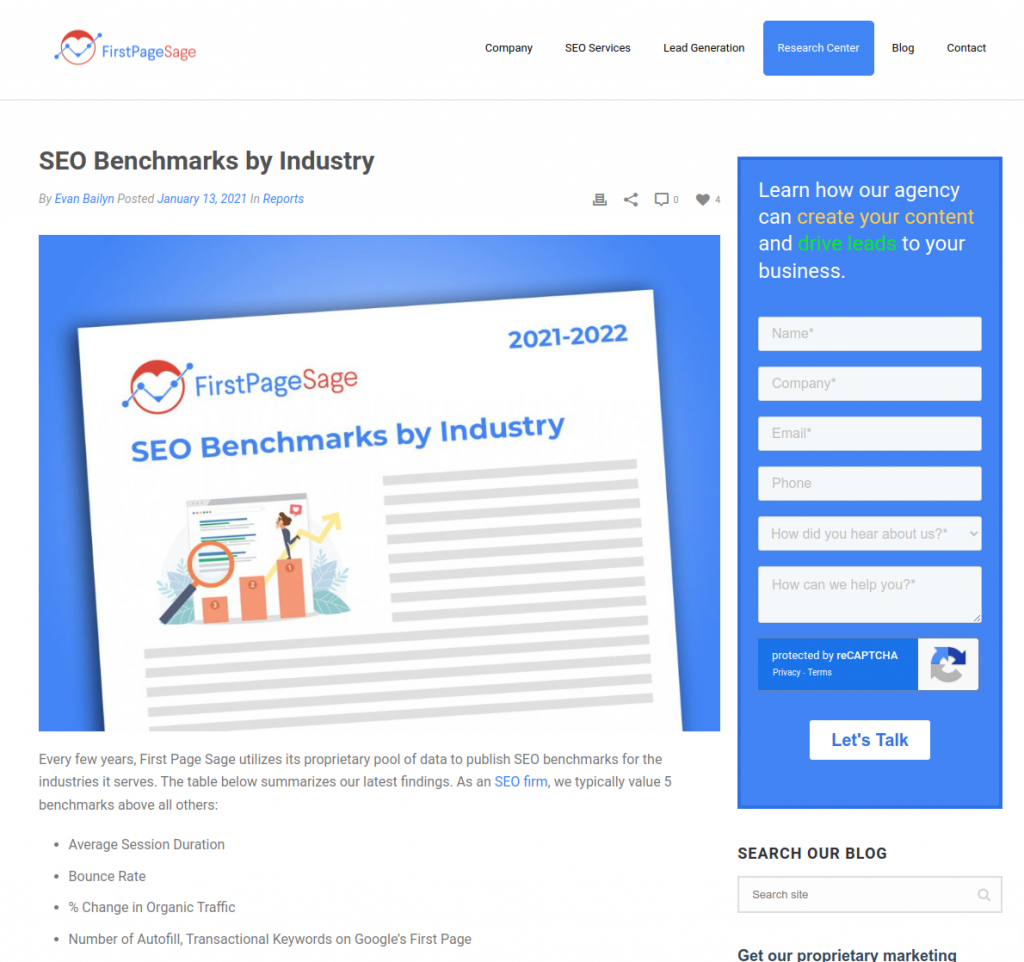
White papers naturally lead to higher conversion rates than most other page types, as taking the time to dig into one is already an indication that a visitor is invested in learning about your products or services. But at the same time, trying to push for a sale in the body of the paper itself will cause your reader to lose trust in the objectivity of your research, and ultimately, your company as well. Instead, your white paper should demonstrate your ability to present and analyze data with clarity and conciseness.
Keep your introduction short and to the point—your reader is most interested in your research. Data visualizations such as tables, charts, and infographics are the best way to present large amounts of information in an easily understandable way, and these will be the most attention-grabbing elements. End with a simple call to action that lets your reader know who to contact for more information. And an important note: don’t publish your white paper as a PDF—this makes it much more difficult to read on mobile devices, and creates a dead end that stops a visitor’s natural journey through your website.
Conversion Optimizing Your Website
The averages above will give you some basic benchmarks to target with your own website, and if yours are low, the first step is to ensure that your team is following CRO best practices as well as the respective guidelines above when creating pages. Another option to resolve poor conversion rates is to outsource your SEO campaign to an expert. This will allow you to focus on the core aspects of your business, while the SEO agency handles conversion optimization, content production, and organic lead generation for you. If you’d like to know more about working with an SEO expert, get in touch.
Further Reading
For more information on conversion rates, see our other reports:
